18032010 Python matplotlib machinelearning
遺伝アルゴリズム
 Machine Learning: An Algorithmic Perspective (Chapman & Hall/Crc Machine Learning & Patrtern Recognition)
Stephen Marsland
Chapman & Hall / ¥ 6,529 ()
通常2~3週間以内に発送
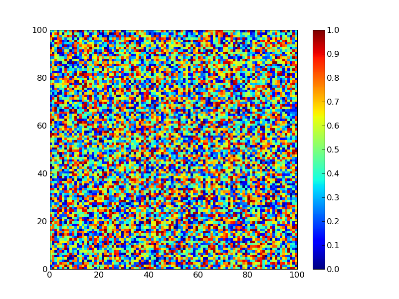
Four Peaks Problemってのがあるらしい。目的関数が
- 最初のビットからの連続した1の長さか最後のビットから連続した0の長さの大きいほう
- 但し、両端の1,0の連続した数が10以上の場合は100ポイント獲得する。
目的関数はこんな感じ。
#!/usr/bin/env python
# -*- encoding:utf-8 -*-

from itertools import takewhile

def o(bits):
   return len(list(takewhile(lambda x: x == 1,bits)))

def z(bits):
       return len(list(takewhile(lambda x: x == 0,reversed(bits))))

def f(bits):
   reward = 100 if o(bits) > 10 and z(bits) > 10 else 0
   return max(o(bits),z(bits)) + reward


if __name__ == "__main__":
    bits1 = [1,1,1,1,1,0,0,0,0,0,0,0,0,0,0,0,0,0,0,0,0,0,0,0,0]
    bits2 = [1,1,1,1,1,1,1,1,1,1,1,0,0,0,0,0,0,0,0,0,0,0,0,0,0]

    for bits in [bits1,bits2]:
        print "score: %d %s" % (f(bits),bits)

#score: 20  [1, 1, 1, 1, 1, 0, 0, 0, 0, 0, 0, 0, 0, 0, 0, 0, 0, 0, 0, 0, 0, 0, 0, 0, 0]
#score: 114 [1, 1, 1, 1, 1, 1, 1, 1, 1, 1, 1, 0, 0, 0, 0, 0, 0, 0, 0, 0, 0, 0, 0, 0, 0]
要するに素直に探索していくとローカルミニマムに落ちるようになっていて、ピークの数が4つあるのでFour Peaks Problem
連続した1,0の長さでcontour plotを描いた。
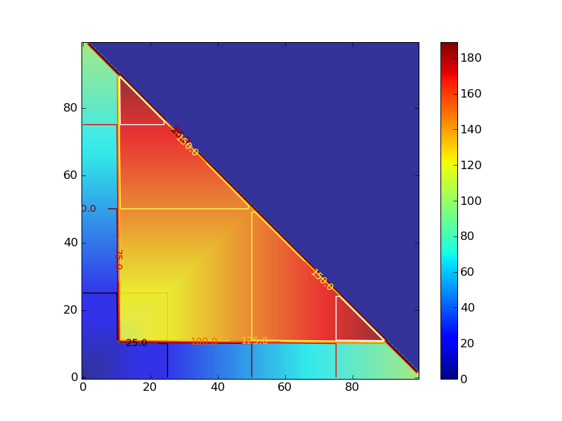
#!/usr/bin/env python
# -*- encoding:utf-8 -*-

def sim_score():
    for x in range(100):
        for y in range(100):
            if x + y > 100:
                yield 0
            else:
                score = four_peak(x,y)
                yield score

def four_peak(x,y):
    reward = 100 if (x > 10 and y > 10) else 0
    score = max(x,y) + reward
    return score

if __name__ == "__main__":
    from pylab import *

    delta = 1
    x = arange(0, 100, delta)
    y = arange(0, 100, delta)
    X, Y = meshgrid(x, y)
    Z = array([z for z in sim_score()])
    Z.shape = 100,100

    im = imshow(Z,origin='lower' ,alpha=.9)
    colorbar(im)

    cset = contour(X,Y,Z)
    clabel(cset,inline=1,fmt='%1.1f',fontsize=10)

    hot()
    savefig('4peaks.png')