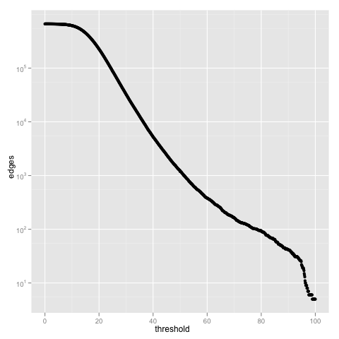
なぜグラフを描くのかと問われれば要約統計量を見やすい形で表現したいからであり、ヒトの目という不完全なデバイスを通してデータを認識するためにはグラフとよばれる表現手段を介したほうが効率が良いからである。
と考えるならば、分析のためにグラフを描くという行為は統計解析と切り離せないものであり、画像を描くためだけのライブラリを選択することはあまりよろしいことではないと思う。
そして望ましくは、適切に前処理されたマトリックスから望むグラフが作られるべきであり、グラフを描くためにデータを(ハッシュなんかに)加工するというのはあまりいいやり方とは言えないんじゃないかなぁと思っている。
これが、Rでグラフを描く大きな理由。データの前処理はRでやることはほとんどなくて、大体はperl,pythonを使うので、rpy2は重宝する。
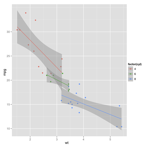
import rpy2.robjects.lib.ggplot2 as ggplot2
from rpy2.robjects import r
from rpy2.robjects.packages import importr
base = importr('base')

datasets = importr('datasets')
mtcars = datasets.mtcars

pp = ggplot2.ggplot(mtcars) + \
     ggplot2.aes_string(x='wt', y='mpg', col='factor(cyl)') + \
     ggplot2.geom_point() + \
     ggplot2.geom_smooth(ggplot2.aes_string(group='cyl'), method='lm')

#pp.plot()
r['ggsave'](file="mypng.png", plot=pp)
#r['dev.off']()
これで、重量(x)と燃費(y)のプロットに対して、気筒毎に回帰直線と信頼区間を描くことができる。
分析手法をテンプレート化して自動的にレポートを出力したい時にはプログラミングできる手段があるといいのでrpy2は良いライブラリだと思う。
 グラフィックスのためのRプログラミング
 Ggplot2: Elegant Graphics for Data Analysis (Use R!)